BluePrint
App Prototype | 2025
About
BluePrint aims to reduce water usage by educating users about the direct environmental and financial impact of their per-appliance consumption while providing actionable water-saving recommendations.
User Research
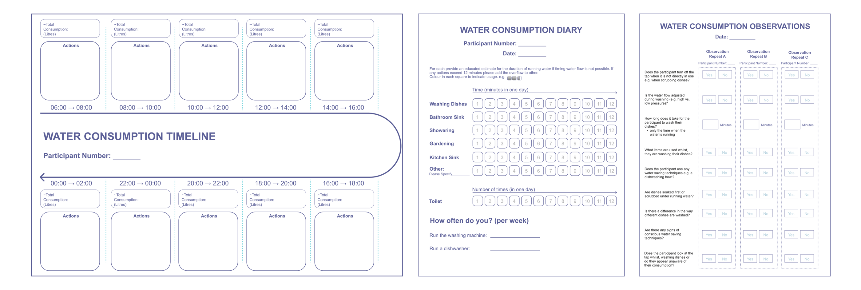
A mixed-methods user research study explored students’ water-use habits through interviews, a 24-hour diary, and observations. Interviews revealed that participants significantly underestimated their water consumption, especially for toilets and showers. The diary method provided more accurate, quantitative insight and showed that tracking usage made participants more aware of their habits. Observations of students washing dishes found little use of water-saving behaviours and highlighted low awareness of simple conservation techniques. Overall, the research emphasised the need for clearer feedback, easier tracking, and practical guidance to help users reduce water consumption.
Left to right: Semi-Structured Interviews, Diary, Observations
Wireframing
Flow A: Track water use (cost and environmental impact) and receive personalised guidance to reduce consumption.
Flow B: Join a community to share water-saving tips and compete to reduce consumption.
To map the low-fidelity structure and layout of key flows.
Paper Prototyping
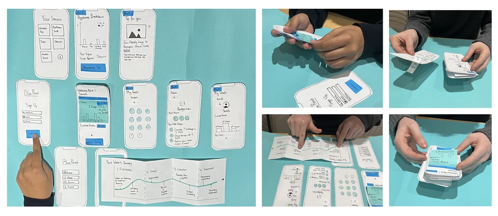
Two rounds of paper prototyping were conducted to refine the app’s primary user journey, including viewing water consumption, appliance breakdowns, and personalised tips. In the first round, users navigated initial screens and highlighted issues such as unclear terminology (“forum”), an overcrowded home screen, and a preference for a more community-focused, social style. The second round tested the full “happy path,” leading to further insights: navigation worked better at the bottom, time indicators needed clarification, and badge designs were visually confusing. These findings informed key design changes, including repositioned navigation, a simplified home screen, clearer timelines, revised badge styles, and fewer unnecessary clicks to streamline user interaction.
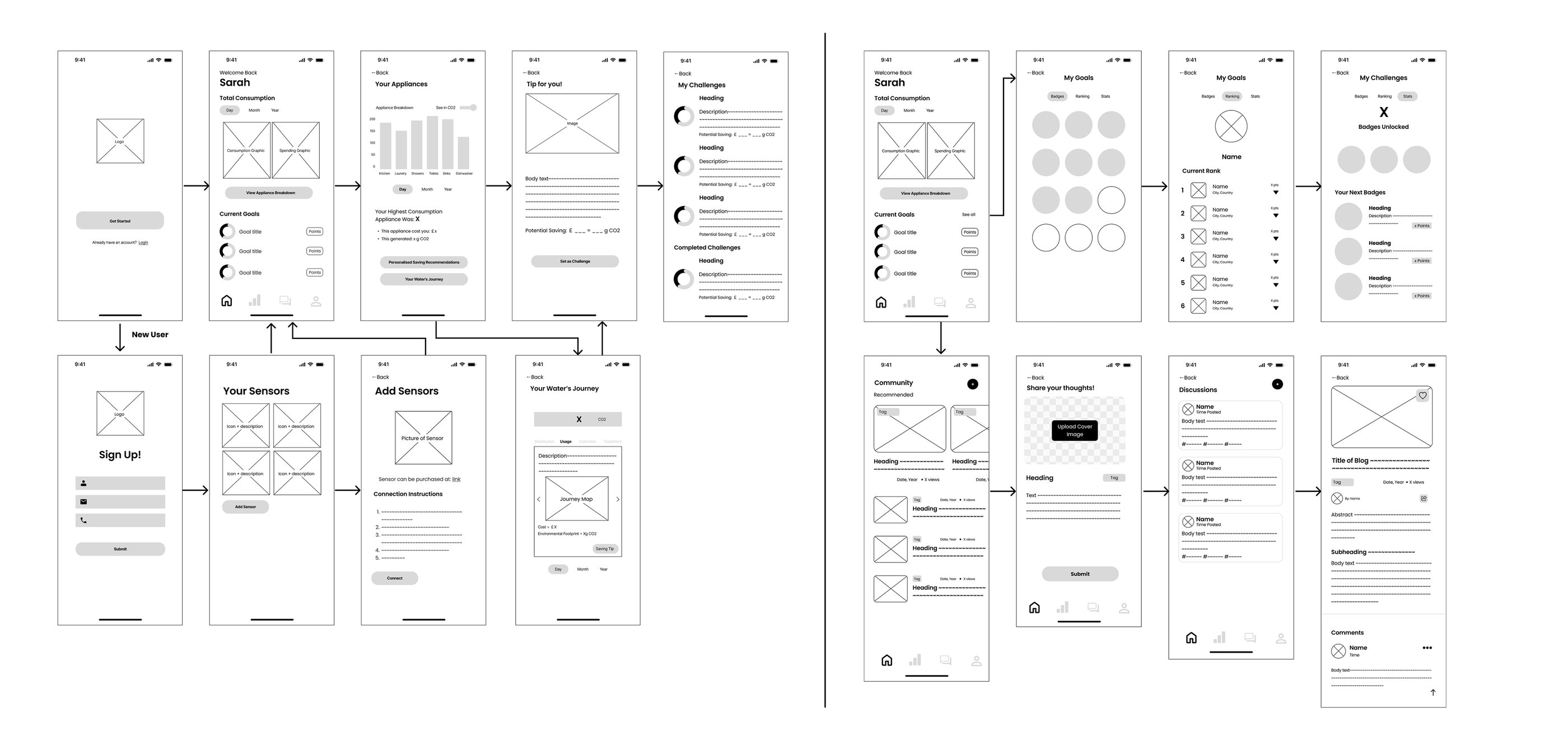
High Fidelity Prototype
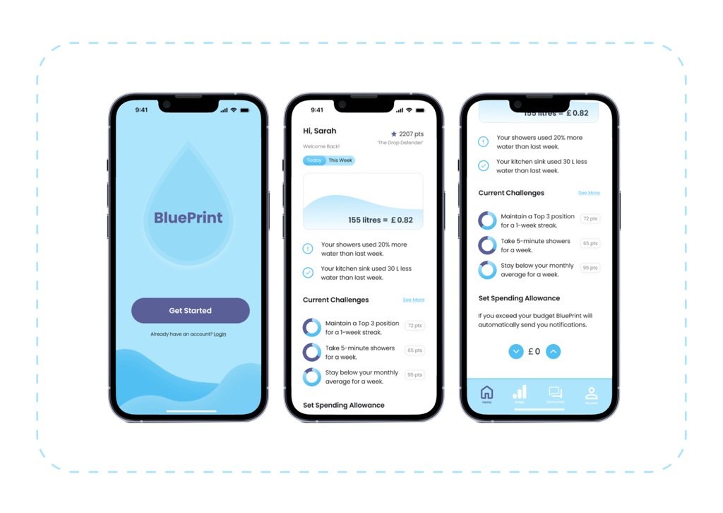
For a full visualisation of all screens and interactions, see the Figma file below.
Examples of app screens
Usability Testing
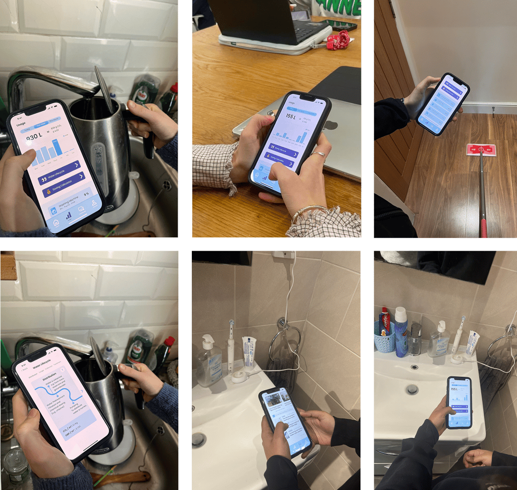
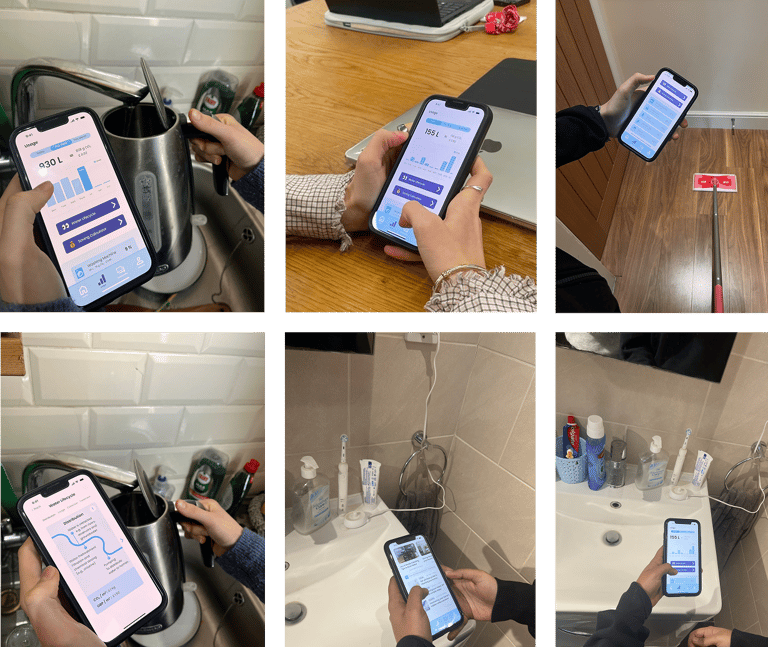
The high-fidelity prototype was tested with six potential users (all 20-23 y/o). Participants received minimal guidance and were encouraged to explore independently.
Inclusivity
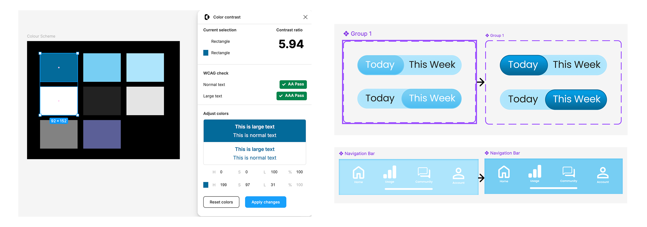
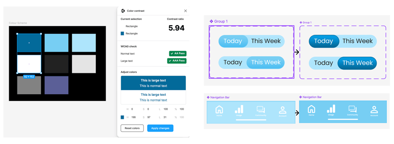
A contrast checker was run for all colour combinations. This led to two changes, the darkest blue was made much darker so that it could be used with white text and the navigation bar was changed to the medium blue. Voice assistance and screen reader support could be a valuable design addition as could a government-supported payment scheme to allow lower income-households to purchase the IOT sensors.